We’re taking a look at the styling options available in the Ultimate Product Catalog WordPress plugin this week in our plugin features series.
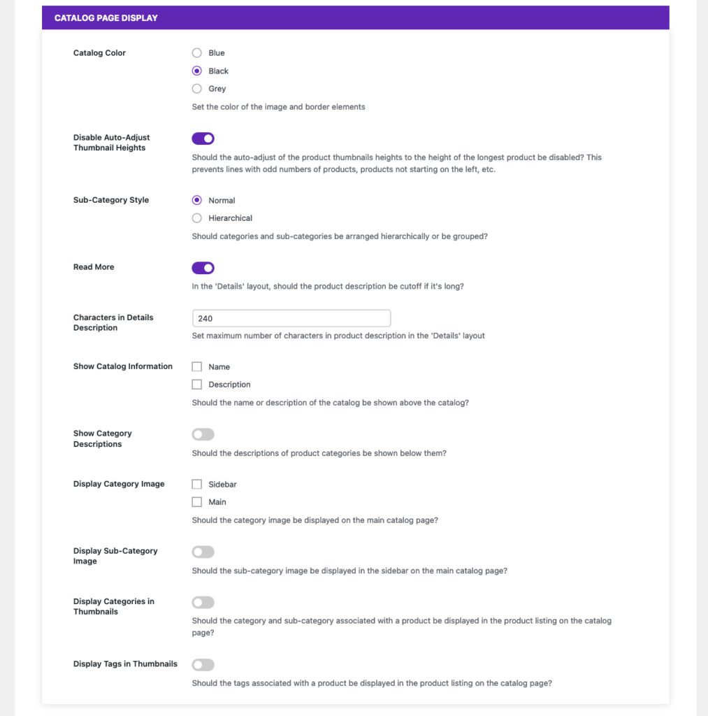
We’ll start with the options available to anyone using the plugin, either the free or premium version, found in the “Catalog Page Display” section of the “Basic” settings. From here, you can do things such as set a general colour for your catalogue, adjust how some elements in the sidebar and “Details” catalogue layout are displayed, and enable descriptions and images for your catalogue, categories and sub-categories.
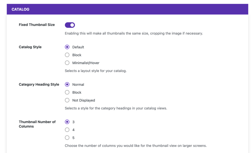
For premium users, there’s also the “Styling” tab in the settings area. The most important styling option is “Catalog Style”, which lets you change the look of the catalogue between the default, block and minimalist/hover styles. There are also a number of structural styling options available, including the ability to change the number of products per column in the “Thumbnail” view, set all of your thumbnails to a fixed size, and adjust how category headings are displayed.
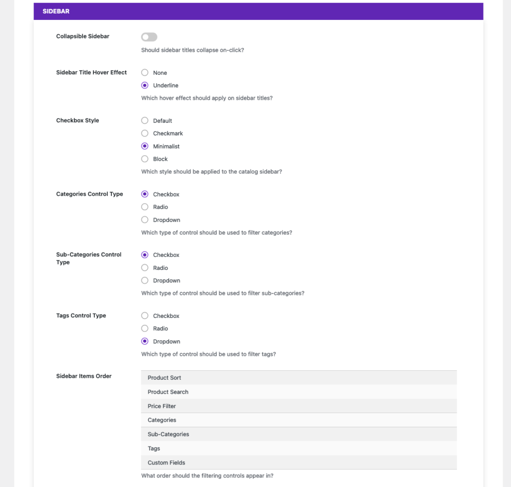
There are also a number of options related to how the sidebar of the catalogue is displayed. You can change which control type is used for main sidebar filters such as categories and tags, adjust the checkbox style used for those filters, and change the order in which the elements are displayed in the sidebar.
Finally, there are a tonne of individual controls that let you change the colours and fonts used throughout the catalogue. Most of these apply to specific views, such as the “Product Price Font Color” in the “Thumbnail” view styling section. These can be used to fine-tune the catalogue display, so that it matches your theme in exactly the way that you want it to.
If that’s not enough customization for you, you can also edit the all of the template files directly, so that the output of the plugin matches your requirements exactly.
Next week, we’ll be moving to our WordPress Order Tracking plugin, where we’ll take a look at the WooCommerce Integration that it offers.


