In an age of commercial cynicism and online savvy, one strategy in e-commerce is staking out a quiet revolution. It’s not a hot new design style or new way to use typography, but actually something that’s woefully underused in e-commerce – and that’s personality.
And before the apprehension sets in, we’re not talking over-the-top gimmicks to get attention, but the exact opposite – actually being relatable and authentic in a way that connects personally with your audience.
Be you, be honest
It’s no secret that people prefer to give their money to companies that they like and with whom they develop a connection. That’s why revealing a bit about you can affect the way customers feel about doing business with you. That means ⇒ sharing your passion for your business, quirky things that you like, or how you see the world. The key is to keep it interesting, yet professional and above all, be honest. Customers can smell phony a mile a way.
Personality is infectious
A great example of using personality well is Man Crates. This company sells manliness at a premium and they do it so well, that you too will be willing to shell out for the privilege of presenting one of their gift “baskets” wrapped in duct-tape with a personalized crowbar.
What’s effective about their website is that you instantly get a feeling of what they’re about – grit, beer, BBQ and humor. Their background image is a pic of their staff dressed in newsboy caps with suspenders, pipes, cigars and their signature wooden crates. You can just sense that this company is about fun – fun that you need to share. Their FAQ’s includes, ‘What happened to the Live Wolverine Man Crate?” and their testimonials have an account from a woman who got a marriage proposal after her epic gift.
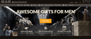
Everything about their site, from the images to the text screams that this company is going to send one hell of a gift and make you a hero. What’s interesting is that any of their items could probably be sourced on Amazon for half the price, but they sell you on their personality. You know, just by browsing their site, that they do humor right and in many cases their audience will want to be a part of what they’re selling.
Show personality with your images
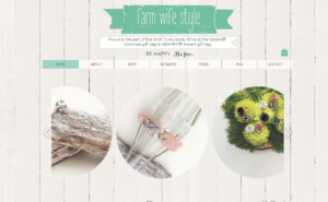
A great example of imbuing personality in a simple, yet effective way is Farm Wife Style. This small Canadian company was recently included as part of the 2016 Oscar and Grammy swag bags.
The handmade jewelry brand is about the freedom, authenticity and the earthiness of farm life. Owner Kim’s website showcases her jewelry on weathered wood, field flowers and bottles, while her “About” copy talks about her ’71 El Camino named Harriet. These are all small, simple details that connect personally with her customers. They get a sense of who they are buying from and they love supporting her and her business.
Use your “About Us” to actually say something about you
Check your site stats and one of your most visited pages will likely be the ubiquitous, “About Us” page. That’s because people want to know about you! Making some changes to this page is one of the simplest and quickest ways to share a bit more personality on your site.
Instead of a laundry list of facts, tell your audience a story. It could be about why you started the business, your amazing staff, some behind the scenes information on your products or services.
Personality doesn’t have to be flashy or in-your-face to be effective, even adding in a simple sentence like:
“We offer our team flexible work schedules, significant autonomy and a challenging environment where creative people can flourish” says a little something about how you see the world and your employees. Customers can connect with that. It makes them feel like they know the kind of people they’re doing business with.
Giving your site personality and personal details will inspire your clients to buy, talk, and tweet about you in a way that a straight forward, buy-my-widget site can’t.
RELATED READING: Etoile Web Design gets a new Face!
Personality Impaired? Here are a few ideas:
 ⇒Use real photos in your “About us”. If you or your staff are not keen on showing faces, take shots of everyone’s work-spaces, lockers, their favorite snack foods, books or their cars. Anything that gives a hint about who they are. If you are a new business or are low on testimonials or reviews, tag some of your products with “Recommended by” and link it to a staff profile.
⇒Rethink your images. Images aren’t just decorative elements. They are in most cases, a significant part of what drives your site’s success. Do they convey the feeling and personality of your products? Are they of good quality? Is there a better way to showcase your products visually that will connect with your audience on a personal level?
⇒Shake up the norm. Try adding a little personality, appropriate to your brand, in areas like FAQ’s or Contact Us. Change “Buy me” buttons to “I need this!” or “It’s mine”. If your business is on the serious side, talk about the work environment you create for your employees, what your team means to your success, or a personal story about your favorite client experience.
Above all, don’t be afraid to be creative and share a bit of who you are and what you love. Remember:
[bctt tweet=”How people feel while vising your website is just as important as what’s on it.”]
You need plugins! We work, so you work less
 This post is brought to you by the team behind some great WordPress plugins that will make your work-life and website better. Download one of our WordPress plugins and connect with us @etoilewebdesign .


